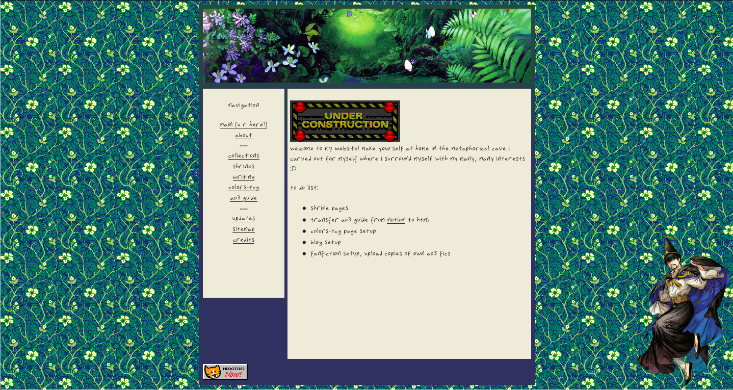
This was my first attempt at making a website in general so forgive how barebones it is. No, I did not know how to make sidebar the same height as the main content. No, I also don't know how I got that extra space under/within the sidebar either.
There was an attempt at making the CSS look nice and I generally get what I was going for but c'mon, I could've done any layout and I went with whatever this is. If you go through the update log you can see this layout only survived like 2 months before I changed it which is self-explanatory.
I hadn't set up the GitHub repo for this site before I stopped using this layout and I can't for the life of me find a functioning backup of it on my computer if it even exists. I say functioning because I do have a version that has an updated version of content from the screenshot but the css is messed up so I have to manually re-edit it together. I have no idea what means I used to get that copy but I don't recommend it.
I do like how I made my own font of my handwriting for this, that was fun. And the use of a gradient for the main background box to blend the header image in.

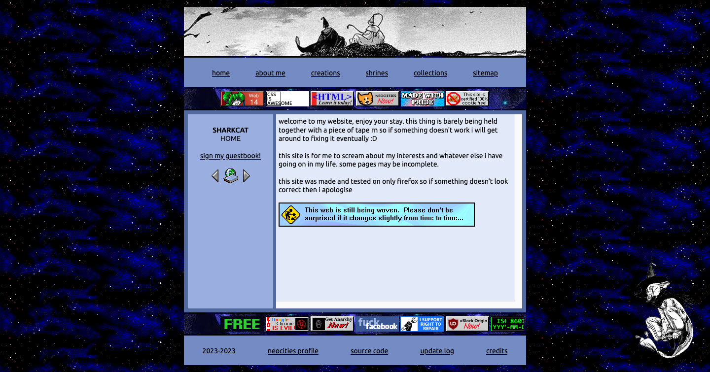
AN ACCEPTABLE LAYOUT!! LETS GOOO!!! I figured out sidebars, added some marquees for scrolling buttons, learned what I enjoy about site layouts.
This is probably my favourite of my past layouts. I used the sidebar to have general info about each page and I really like that concept.

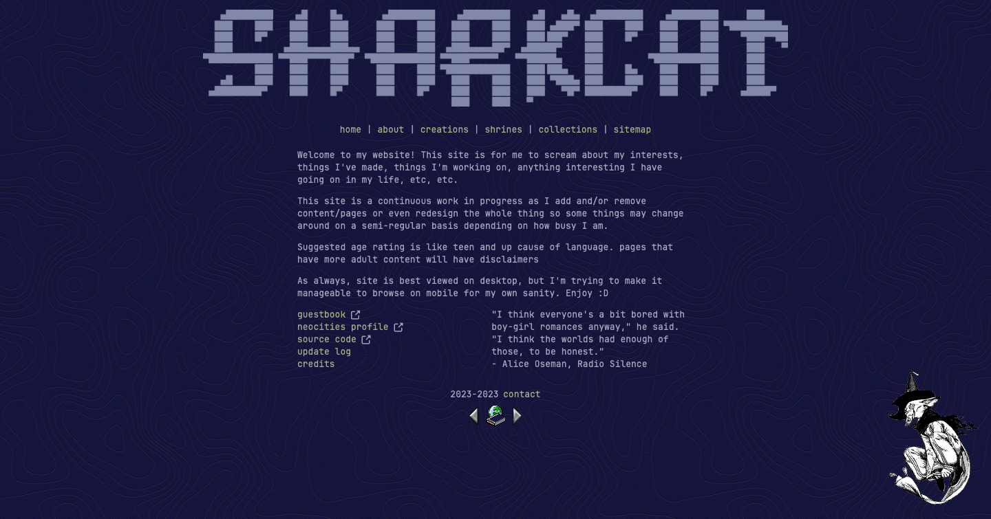
I enjoyed how it was straight to the point but its also extremely fucking boring.
The general point of this was that it should be simple to the point where I don't get overwhelmed in adding new content and figuring out how to make the layout consistent but this had the opposite effect in that it was boring :D
I don't know why I was so committed to the less than full width centered layout but this was the third version of that.
